Stop Talking & Start Digging: The Importance of Getting Dirty with Data

Today’s world can be characterized by increasing speed, complexity, disorder, and interconnectedness. For organizations trying to understand their operating environment, develop products, improve services, advance their mission, identify gaps, and support overall decision-making and strategic planning, this presents a wide array of challenges. As a result, organizational processes should be focused on overcoming these challenges and should be driven by the desire for solutions – forward-looking solutions that better understanding, improve productivity, increase efficiencies, and maximize the chance for success.

Finding or creating a solution to a complex problem requires careful planning and thought. We must beak down the problem into simpler, manageable components, identify and characterize root causes, and involve relevant stakeholders in discussions and feedback sessions. We must look across our sources of data, identify any real limitations and gaps, and plan how to execute some analytical methods across the data to extract insights. The problem is, in a world of accelerating information, needs, and problems, it’s just too easy to get caught in the planning and thinking stage. We need to get down and dirty with our data.

In the year 2011, we are surrounded by resources, libraries, catalogs, tools, and software – much of it open source and/or freely available for our own personal (AND collective) use. We must learn to access and leverage these resources efficiently, not only to perform cleansing and synthesis functions, but also to inform our collection and analysis processes to make them better as time goes on. Armed with these resources and tools, we must feel comfortable jumping right into our data with the confidence that insights will be gained that otherwise would have been lost in time.

Slicing is a helpful example of this. When faced with a high-dimension data set, usually with poorly described variables, start by slicing the data into a manageable chunk with high-powered variables – time, location, name, category, score, etc. Use a data visualization program to understand order, geospatial distribution, or categorical breakdowns. Describe the data and ask questions about how collection processes led to any gaps that exist. Simple slicing and dicing separate from the root analysis can often chart a potentially workable path forward.

The bottom line is that whether it’s dirty data or larger-scale, socially-complex problems, we sometimes need to shorten the discussion of the problem itself and get our hands dirty. Sometimes we need to create a little chaos upfront in order to shake things loose and find our intended order, structure, and path forward. After all, planning your dive is important, but sometimes you need to just dive in and see where it leads you.

Visualizing the U.S. Men’s National Soccer Team Roster

As the World Cup approaches, countries begin to solidify their rosters, trying to optimize their squad to give the best chance of taking home the FIFA trophy. As the Bob Bradley recently announced the United States’ 30-man roster, we wonder where these players come from and how can their stats be visualized?

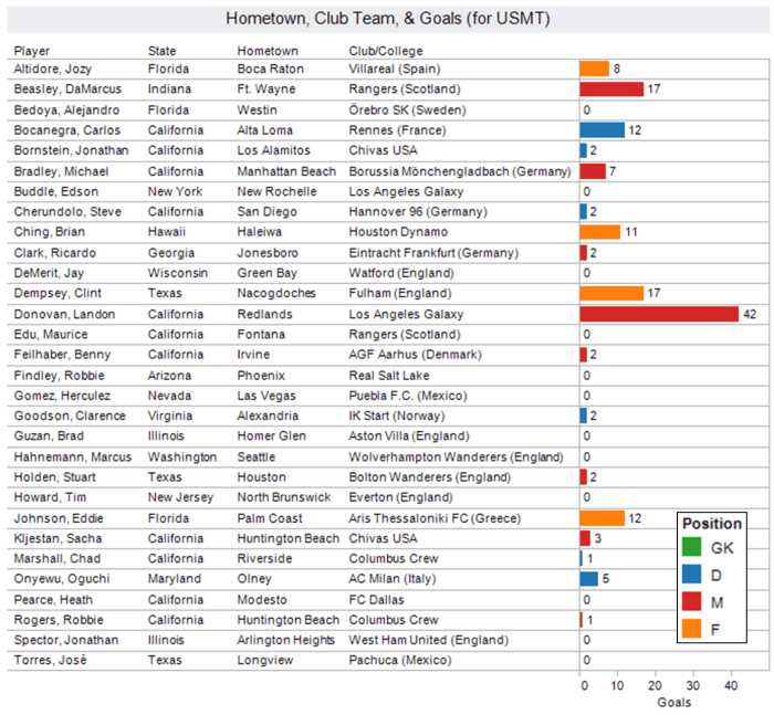
Obviously, it would be most valuable to visualize comprehensive stat sheets of the U.S. team players against all other teams and their players, especially the others in Group C (England, Algeria, Slovenia). Unfortunately, I don’t have that much time! So, elementary as these may be, here are some quick visualizations, given the data provided on the US Men’s National Team (USMNT) website.

1. Full 30-Man Roster, with Hometowns, Club Teams, and Total USMNT Goals (by Position)

2. Player Experience (Age vs Total Caps, by Position)

3. Player Size (Height vs Weight, by Position)

Some things to note, although I have not determined an international baseline from which these conclusions can be definitively made, is that our goalkeepers are old and our midfielders are relatively small, young and inexperienced. But I bet you didn’t need me to tell you that!

Regardless, the World Cup is surely a global spectacle and I’m very much looking forward to it. Hopefully the US squad can take Group C and show some true grit and determination on the international stage. Four weeks to go…

A List of Some Web Data Sources

Well I needed to pull together a listing of publicly available data sources for a project, so I figured I’d post them here as well. Some descriptions and tag lines have been taken directly from the website, and some I quickly created on my own. This list is by no means comprehensive (I probably have about 100 links in the “Data” folder of my bookmarks…) but it’s a quick snapshot at some useful data sources on the web. That being said, there are a lot of considerations when targeting a data set and tomorrow’s need for data will most likely differ from today’s need for data. Build and execute a target data strategy using the vast sets of search engines, libraries, and social networks on the web and you’ll be just fine.

AggData – The advantage of AggData is that the data is collected into one file that is very raw and portable, which makes it easy to integrate into any application or website. You can browse free data sets or purchase any of the many data sets from public and private organizations for a relatively small fee.

The Association of Religion Data Archives – The ARDA Data Archive is a collection of surveys, polls, and other data submitted by researchers and made available online by the ARDA. There are nearly 500 data files included in the ARDA collection. You can browse files by category, alphabetically, view the newest additions, most popular files, or search for a file. Once you select a file you can preview the results, read about how the data were collected, review the survey questions asked, save selected survey questions to your own file, and/or download the data file.

Census.gov American FactFinder – In American FactFinder you can obtain data in the form of maps, tables, and reports from a variety of Census Bureau sources. Click here for a good listing of available data sets, visualizations, and search functionalities.

CIA World Factbook – Contains a lot of country-level metrics/statistics, although they are not very easily exportable and/or available in table format.

City Population – Gazetteer of global geographic data and limited demographic statistics per location.

Data360 – This is essentially a wiki for data. Data360 is an open-source, collaborative and free website.  The site hosts a common and shared database, which any person or organization, committed to neutrality and non-partisanship (meaning “let the data speak”), can use for presentation of reports and visualizations about the data.

Data.gov – The purpose of Data.gov is to increase public access to high value, machine readable datasets generated by the Executive Branch of the Federal Government. Although the initial launch of Data.gov provides a limited portion of the rich variety of Federal datasets presently available, we invite you to actively participate in shaping the future of Data.gov by suggesting additional datasets and site enhancements to provide seamless access and use of your Federal data. Visit today with us, but come back often. With your help, Data.gov will continue to grow and change in the weeks, months, and years ahead. For more information, view our How to Use Data.gov guide.

Data Marketplace – Buy and/or sell data. You can request data sets for others to build and provide for a small fee.

DBpedia – DBpedia is a community effort to extract structured information from Wikipedia and to make this information available on the Web. DBpedia allows you to ask sophisticated queries against Wikipedia, and to link other data sets on the Web to Wikipedia data.

EconoMagic – A directory of data sets specific to US states.

Factual – Factual is a platform where anyone can share and mash open data on any subject. Factual was founded to provide open access to better structured data.

FedStats – Provides access to all federal statistical agencies (by geographic scope or listed alphabetically) with a search function to discover available data sets across all US federal statistical agencies.

GapminderA non-profit venture that, through a interactive viz tool accompanied by a listing of available data tables, aims to “unveal the beauty of statistics for a fact based world view”.

GeoCommons Finder! – Upload, organize and share your Geographic Data. Then you can use their built in application called Maker! to map/visualize it.

GeoNames – The GeoNames geographical database covers all countries and contains over eight million placenames that are available for download free of charge.

Global Airport Database – Comprehensive set of global airport data (download available for free).

Global Health Facts – Search global data by health topic and/or country. You can also interactively compare data for up to five countries at a time.

Google Public Data – In addition to plainly using the main Google search engine to search for a specific data set, Google has a public data library with some valuable sets available for free.

Guardian.co.uk Data Store – Governments around the globe are opening up their data vaults – allowing you to check out the numbers for yourself. This is the Guardian’s gateway to that information. Search for government data here from the UK (including London), USA, Australia and New Zealand – and look out for new countries and places as we add them. Read more about this on the Datablog. Full list of government data sites here.

Harvard Geographic Information Systems – Contains a highly credible listing of various national and international data providers and data sources, with a strong focus on geographic data.

International Civil Aviation Organization (ICAO) – Global air traffic data available for a fee.

Infochimps – Request data sets, search for existing data sets, or post and sell your own data sets.

International Statistical Agencies
US Census Bureau: http://www.census.gov/aboutus/stat_int.html
US Bureau of Labor Statistics: http://www.bls.gov/bls/other.htm
United Nations: http://unstats.un.org/unsd/methods/inter-natlinks/sd_intstat.htm

MelissaData – Buy comprehensive zip code data for about $150. Tailored for businesses with use in marketing.

NationMaster – NationMaster is a massive central data source and a handy way to graphically compare nations. NationMaster is a vast compilation of data from such sources as the CIA World Factbook, UN, and OECD. Using the form above, you can generate maps and graphs on all kinds of statistics with ease.

National Association of Counties (NACO) – Includes a US county data library.

Numbrary – Numbrary is a free online service dedicated to finding, using and sharing numbers on the web.

OECD Stat Extracts – OECD.Stat includes data and metadata for OECD (Organization for Economic Cooperation and Development) countries and selected non-member economies.

QuickFacts (US Census Bureau Site) – Quick, easy access to facts about people, business, and geography.

StateMaster – StateMaster is a unique statistical database which allows you to research and compare a multitude of different data on US states. We have compiled information from various primary sources such as the US Census Bureau, the FBI, and the National Center for Educational Statistics. More than just a mere collection of various data, StateMaster goes beyond the numbers to provide you with visualization technology like pie charts, maps, graphs and scatterplots. We also have thousands of map and flag images, state profiles, and correlations.

United Nations Development Programme (UNDP) – Includes UN Human Development reports and statistics such as the Human Development Index.

USA Counties (US Census Bureau Site) – A directory of data tables for US states and individual counties. Includes over 6,500 data items.

Weather Underground – Provides free access to historical weather data for cities around the globe.

Wolfram|Alpha – Deemed a “computational knowledge engine”, the W|A search and discovery tool is mathematically-based and tries to turn queries (term-based or data-driven) into actionable knowledge with visualization of in-house data sets and information relevant to your query.

World Gazetteer – The World Gazetteer provides a comprehensive set of population data and related statistics.

World Port Source – Contains extensive data on global sea ports, characterized by size and searchable by shipping liners and other various data fields.

A Visualization Of Deadliest Earthquakes Since 1900

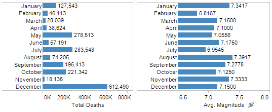
Earlier today, The Guardian DataBlog resourcefully provided a link to USGS earthquake data. The table lists all individual earthquakes that have caused 1,000 or more deaths, since 1900. Data elements include date, location, latitude, longitude, deaths, and magnitude. Below are some summary tables and a map that visualize this data. You can also click here for some USGS maps of the Haiti earthquake.

Map of Deadliest Earthquakes, 1900-2009
Dot Size = Total Deaths,
Dot Color = Average Magnitude

Summary of Deadliest Earthquakes by Year, 1900-2009

Summary of Deadliest Earthquakes by Month, 1900-2009

Investigation of Relationship Between Earthquake Magnitude and Deaths, 1900-2009

As a note for the right-side plot, I’ve cut out the earthquakes causing more than 20,000 deaths to just look at those causing between 1,000 and 20,000 deaths. Looking at the entire data set, the correlation coefficient for earthquake magnitude and total deaths is about 0.286 which represents a weak positive relationship between the two variables. Obviously, the existence of a relationship does not imply that a higher magnitude earthquake causes more total deaths, but it is insightful to identify a relationship between the two variables to inspire more investigation. Moving forward, one might investigate the data for clusters based on geo-location, decade, or season (controlled for hemisphere).

My thoughts and prayers go out to those affected by the Haiti earthquake.

Links

The Ultimate Personal Dashboard

With some great technological advancements in the past decade, why am I still organizing my life in bookmarks and spreadsheets?

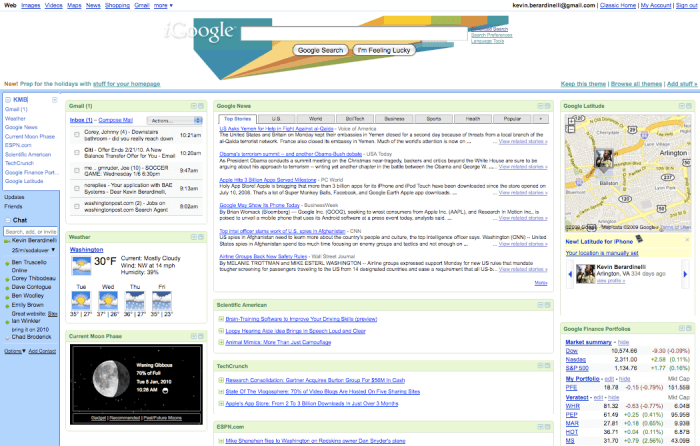
The next great technology needs to get more personal. We need to drop the rectangular web browser and think in higher dimensions. Let’s say iGoogle meets Macbook Dashboard meets a much better version of the new Yahoo! homepage meets the iPhone application platform. I’m talking about a secure, personal, customizable dashboard/portal through which one can live. It’s where I’ll track my information, both from the web and my mind to better organize and optimize my life. It’s where I’ll see and interact with my personal data in a comprehensively insightful yet very organized environment.

Right now, how do I track my information? Some is on the web, some is on my hard drive, and some is on paper. I have over 200 username and password combinations I use to login to various sites. I’ve got at least 250 bookmarks in 15 top-level categories. I’ve got spreadsheets that summarize my finances and visuals I’ve created to try and learn about them. For now, when I need to know something, I find the appropriate link, look up my account credentials (if not stored), and then investigate. But for those in a similar place in life, are my personal needs really that different?

If I list out all the things I do online, all the things I read online, all the information I organize on my computer, all the personal resources I access online, and all the questions I might have about myself, can I begin to minimize some clutter? Can I get Google Reader, Macbook Dashboard, iGoogle widgets, social network widgets, and personal spreadsheets in a secure, organized interface? Please?

Base

  • Accounts – Search logins by account, email, username, password, notes, date added, date updated
  • Address Book – Contact Info, birthdays, anniversaries
  • Links – Yahoo!, Google, GMail, CNN, Wolfram|Alpha
  • System Stats – Files/Folders, latest backup, storage space
  • Weather – Today’s weather, 7-day forecast, full interactive radar/satellite map

Financial

  • Bills – Due dates, billing cycles, average costs due
  • Energy Monitor – Monitor your home utilities, set “green” goals
  • Finances Monitor – Monitor stocks, IRAs, retirement, savings, checking, credit card
  • PayPal – Request/receive payments, see pending invoices
  • Subscription Management – Expected issues, renewal dates,

News/Events

  • Coming Soon – Movie releases, Tickets on sale, Upcoming concerts (Thrillist, Ticketmaster, Fandango)
  • Google Reader Tracker – Total unread, shared items, etc.
  • Local – Weekend Events (Going Out Guide, Eventful, etc.), Breaking News
  • News – CNN News Pulse
  • Sports – Scores/News

Social Media/Networking

  • Brand Monitor – See sentiment for desired keywords/terms
  • Discussion Board Monitor – Track your posts and comments, desired forums
  • Hot Topics – See trend topics and most searched items
  • Notifications – Facebook, LinkedIn, Twitter
  • Social Timeline – LinkedIn Updates, Twitter Lists, Status Updates
  • Web Analytics – Twitter Stats, Google Analytics

Entertainment

  • Movies – Times, upcoming releases, IMDB search, RottonTomatoes rankings
  • Music – Playlists, connect with Grooveshark albums, iTunes Radio, etc.
  • Photos – Flickr/Picasa portlet
  • Sports – Fantasy team tracker, favorites scoreboard, breaking news
  • TV – Guide, schedule of favorites, DVR control

Health

Lists

  • Map – Where I’ve Been, Where I want to go
  • Reading List – What I’ve Read, What I’m Reading, Connect to Amazon
  • Recipes – Saved links, suggested items, BigOven link
  • Shopping – Grocery (connect with PeaPod), Retail deals/coupons
  • Tasks / To-Do
  • Watch Lists – eBay Auction, StubHub
  • Wish List – Amazon, iTunes, Retail Stores

Utilities

  • Calculator
  • Currency Conversion
  • Dictionary/Thesaurus (Wordnik)
  • Flight Tracker
  • Job Tracker – Monster, USAJobs, search agents
  • Maps – My placemarks, directions, search locations
  • Shipment Tracker – UPS, USPS, FedEx, etc.
  • Translator

This is just a list of things I do, need, have, and want. Obviously there are a lot more to be added. It’s important to note that all of these widgets/portlets have a similar foundation that parallel the major dimensions (in light blue) I spoke about in my earlier post on the boundaries of the human condition:

Accounts – List of all companies/organizations. Information is tagged by the company and all info can be found with regards to that account, when needed.
Dates/Time – Many things are calendar-based and should be aggregated to a personal, customizable calendar view
People – Address Book is a foundational database. People can be searched throughout for linkages and notes.
Places – With the current technological trend, many needs are location-based (including news and tweets). Personal organization dashboards should leverage geo-tagging for contextualization of information to the user.

It’s also important to note that most people want information in 3 forms: a quick preview, an expanded summary, and an interactive tool. This follows closely with a recent social trend – high variability in the speed with which we move. Sometimes we want a snapshot of our current personal information because that’s all that we have – a few seconds of time. At other times, we may have a few minutes of free time, most likely coupled with a defined question or purpose:

“How much do I have in my checking account?”
“What will the weather be like this weekend?”
“Need to transfer rent money to roommate.”
“Did my package arrive safely?”
“Who has a birthday in the next month?”
“What are the hot news items of the day?”
“I want to buy a book from my Amazon wish list.”
“To which country should I travel next summer?”

And finally, this cannot be overwhelming. It needs to be there when you need it but not short circuit your mood if you don’t check it for three weeks. All charts and graphics need to be simple and interactive and customizable, but also intelligent in design to attract the most novice of digital users.

So what will the next decade bring us? Will personal desktop technology be able to fully leverage the vast amounts of data we have online, on our computers, and in our heads? Will the world become more stat-conscious, and learn to take insight from the graphical display of life data? Will the desire for a less-click lifestyle drive better personal dashboards for secure, centralized organization? I hope so.

Current DC Snow Snapshot & Stats

Well there’s lots of snow in DC! Reports say this will surpass total snowfall of any storm in the past decade, and we may have to look even farther back than that. Right now (9:30 AM ET) there is about 10 inches or so, and it’s still coming down fast and fluffy. Woohoo!

To put this in perspective, let’s look at some average monthly snowfalls for the Washington, DC area vs the rest of the United States. Data is from the National Oceanic and Atmospheric Administration (NOAA) National Climatic Data Center (NCDC) and represents the past 40 years of data for DC and (on average) 52 years for the rest of the United States. Total stations is 276, many from the weather stations at regional/national airports. Here is the raw data set (before I cleaned it up for visualization).

To note, the total average annual snowfall for Washington, DC is about 19.5 inches, while the total average annual snowfall for the rest of the United States is about 32.2 inches. This does, however, include some extreme values from Alaska (and Puerto Rico for some zeros too). The maximum annual snowfall was at Valdez, Alaska with 326.0 inches. If I was to do this comparison again, I might trim some extremes from both sides of the data set, but now it’s time to go play in the snow.

Happy Planet Index vs Human Development Index

With my post on “Everything is Connected” I thought I’d investigate a bridge between happiness and the level of development in a country…

The Happy Planet Index (HPI)

“The HPI is an innovative measure that shows the ecological efficiency with which human well-being is delivered around the world. It is the first ever index to combine environmental impact with well-being to measure the environmental efficiency with which country by country, people live long and happy lives.”

The Human Development Index (HDI)

“The first Human Development Report (1990) introduced a new way of measuring development by combining indicators of life expectancy, educational attainment and income into a composite human development index, the HDI. The breakthrough for the HDI was the creation of a single statistic which was to serve as a frame of reference for both social and economic development. The HDI sets a minimum and a maximum for each dimension, called goalposts, and then shows where each country stands in relation to these goalposts, expressed as a value between 0 and 1.”

Thoughts and Hypotheses

There are two relationships we will want to consider:

  • Correlation: Is there any direct relationship (positive or negative) between the values of the HDI and HPI?
  • Clustering: By region (or other characteristic field) can we find any clusters in the data?

Since these are composite indices of several weighted variable inputs, hopefully this top-level approach can identify some possible matches and mismatches between underlying data fields too. Related to the HDI, I bet the UN’s HPI (Human Poverty Index) has a bridge to happiness… or most likely, unhappiness.

Data/Discussion

  • There seems to be a connection between deviations in the data. When there exists a large deviation, for a specific region, for the HDI, there seems to also be a large deviation of values for the HPI. Notice that Africa, Australasia, and the Middle East all have similar double-digit deviations. What does this tell us about the range of development and happiness within a specific region? Perhaps this could be tested across many country-level metrics to see if the similar deviations occur more frequently.
  • As with the above note, since we have these metrics on a same scale/range, let’s combine them to see who has the highest composite score. In alphabetical order we have: 84, 125, 138, 137, 133, 134, 126, 134, 119, 117, 119. There seem to be three groups here: High (>130), Medium (100-130), Low (<100). Depending on a user need, algorithms can be created to join metrics to provide a big picture representation of economic, political, sociological, etc metrics, and flexibility can be built to dig into the weeds on the underlying data. This would be a nice comprehensive framework for understanding how countries (and regions as a whole) change over time.


  • Looking at the scatter plot, it is clear that some clusters may exist, for example with Africa (blue). Caribbean (orange), Europe (green), and Russia and Central Asia (purple) also show some quick visual clustering, while the Middle East (red) shows the opposite. What could this mean? That regional trade, policy, weather, etc are good supplementary foundations for providing happiness and development?
  • We could add trend lines and quickly check for any linear (or logarithmic) relationships. If any relationship does exist as a whole or with a region, it is certainly not a directly proportional or inversely proportional one. This was expected as these metrics are quite different (despite the overlap in life expectancy as an input dimension).

Moving forward, the methodologies and underlying dimensions (with their sources) should be compared. Data is always good, but with good data one still must be careful. That being said, this is a good start for a much larger investigation into the connections between different country-level metrics, especially if they are to be used in international and national policy.

shapes and squiggles

Armed with a pencil and paper, you can simplify about 99% of the world’s problems.

Despite a couple decades of extra-substantial technological growth, there are two things that can never be replaced: the pencil and paper. For the toughest analytical challenges, only so much can be done computationally to simply and digest such problems. For these challenges, the solutions should start with a pencil and paper.

The first step in breaking down a problem is the conversion of the problem from the brain’s three dimensional space to a the two dimensional space of paper. In mathematics, there are several examples of such similar breakdowns: matrix decompositions, polynomial factorizations, projections, transforms, etc. The breakdown is necessary to see things in a new light, a simplified light, and a light that otherwise may not have been turned on.

Step 1. Grab a pad of paper. Do not put boundaries on where you can write and draw.
Step 2. Grab a pencil. Sharpen it and keep the pencil sharpener close.

So now that we have pencil and paper in hand, what do we draw? Well here’s my point. There is a geometric toolbox that provides a valuable framework for the problem solving environment. These are the shapes and squiggles.

1. Matrices

Two-by-two matrices are especially valuable for initial sorting of qualitative data. Assign a binary variable to each axis, name the cells, and define the relationships. Categorizing concepts and attacking each cell independently can help find hidden relationships and provide insight for subsequent analyses. See my previous post on matrix power for more on matrices.

2. Graphs

For more quantitative and scaled concepts, draw a set of axes to start. Visualize relationships between variables by drawing lines or curves and then attack each extremum and graphical sector. Plot knowns and/or hypotheticals on the graph and decipher the meaning of specific coordinates. Jessica Hagy’s blog ‘Indexed’ is a good example of translating mind to graph.

3. Lists and Mind Maps
The proper organization of information is often the most valuable visual tool in solving complex problems. Of course there are technologies to assist in the visualization and organization of information (mind maps, spreadsheets, etc.) but it’s important to use pencil and paper as the primary stepping stone to using some software/web app. Check out a mind map on different mind mapping software and a post on five great uses of mind maps.

4. Circles

Circles have shape and have a shape that is unique. They overlap well, fill space comfortably, and are easy for the human mind to spatially interpret. Eulerian circles (or Venn diagrams) are the simple example of circles put to use on paper for analytical means. There are several other adaptations of circles for comparative reasoning, such as with GL Hoffman’s “gruzzles”.

5. Doodling

The mind works in mysterious ways. Drawing without bounds can release otherwise inexpressible thought. There’s the somewhat structured doodling such as with UI mock-ups, schemas, and decision trees, and very unstructured doodling that might look like an impossible maze of dots and lines. The importance lies in the fact that your brain knows most about the problem, and the pencil is driven by the brain. Any new representation put forth on paper, by your brain, is a new representation of that problem not previously seen. In other words, “doodling allows the unconscious to render in symbolic expression”.

The shapes and squiggles live on. And the shapes and squiggles will always live on because they are the simplest yet most powerful functional tools our mind can use to express our conscious, subconscious, and unconscious thoughts.

aspiration pathways

First of all, I believe that you should never grow up. Never. Be a kid at heart, always. Age is just a reference point and should not characterize who you are. Sure it identifies how long ago you were born, but not your level of maturity, your accomplishments, or your potential.
That being said, it’s funny to see how one has changed over time. Many times, the first question you are asked as a kid is, “What do you want to be when you grow up?” I’m sure I’ve had some pretty crazy answers, some that stretched my mind and some that were just meant to make my parents mad. Omitting some (astronaut, inventor, game show host, chef) here are some of my job desires as they have changed over time.
You’ll see doctor was in late high school and early college, then disappeared quickly. Fireman has lingered since the local fire captain (Mr. Fioretti) had me demo stop, drop, & roll in kindergarten. Athlete took a natural parabolic trip through adolescence and tailed into my twenties. Ruler of the world was on an obvious decline since conception as more and more barriers to that role popped up. Professor has been on a steady incline, as is being an educator of any kind. And with that, being an adsideologist skyrocketed early in college as I truly hope I can spend the rest of my life helping others learn and gain a comfortable understanding of life and the world.
It’s also interesting to find the ages at which the most paths changed, and where the paths changed the most. College was obviously a pretty turbulent time regarding aspirations, as it probably was for most who have gone through it. Steep slopes and frequent intersections of these aspiration pathways. A great thing perhaps, as the times of greatest change can be the most valuable learning experience.
So how about you? What do your aspiration pathways look like?