Earlier today, The Guardian DataBlog resourcefully provided a link to USGS earthquake data. The table lists all individual earthquakes that have caused 1,000 or more deaths, since 1900. Data elements include date, location, latitude, longitude, deaths, and magnitude. Below are some summary tables and a map that visualize this data. You can also click here for some USGS maps of the Haiti earthquake.
Map of Deadliest Earthquakes, 1900-2009
Dot Size = Total Deaths,
Dot Color = Average Magnitude
Summary of Deadliest Earthquakes by Year, 1900-2009
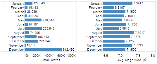
Summary of Deadliest Earthquakes by Month, 1900-2009
Investigation of Relationship Between Earthquake Magnitude and Deaths, 1900-2009
As a note for the right-side plot, I’ve cut out the earthquakes causing more than 20,000 deaths to just look at those causing between 1,000 and 20,000 deaths. Looking at the entire data set, the correlation coefficient for earthquake magnitude and total deaths is about 0.286 which represents a weak positive relationship between the two variables. Obviously, the existence of a relationship does not imply that a higher magnitude earthquake causes more total deaths, but it is insightful to identify a relationship between the two variables to inspire more investigation. Moving forward, one might investigate the data for clusters based on geo-location, decade, or season (controlled for hemisphere).
My thoughts and prayers go out to those affected by the Haiti earthquake.
Links


Fantastic – have you thought about posting some of these on our flickr group?