The Ultimate Personal Dashboard

With some great technological advancements in the past decade, why am I still organizing my life in bookmarks and spreadsheets?

The next great technology needs to get more personal. We need to drop the rectangular web browser and think in higher dimensions. Let’s say iGoogle meets Macbook Dashboard meets a much better version of the new Yahoo! homepage meets the iPhone application platform. I’m talking about a secure, personal, customizable dashboard/portal through which one can live. It’s where I’ll track my information, both from the web and my mind to better organize and optimize my life. It’s where I’ll see and interact with my personal data in a comprehensively insightful yet very organized environment.

Right now, how do I track my information? Some is on the web, some is on my hard drive, and some is on paper. I have over 200 username and password combinations I use to login to various sites. I’ve got at least 250 bookmarks in 15 top-level categories. I’ve got spreadsheets that summarize my finances and visuals I’ve created to try and learn about them. For now, when I need to know something, I find the appropriate link, look up my account credentials (if not stored), and then investigate. But for those in a similar place in life, are my personal needs really that different?
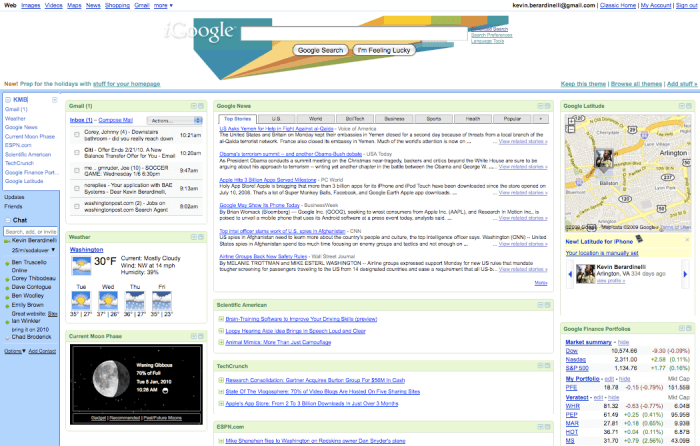
If I list out all the things I do online, all the things I read online, all the information I organize on my computer, all the personal resources I access online, and all the questions I might have about myself, can I begin to minimize some clutter? Can I get Google Reader, Macbook Dashboard, iGoogle widgets, social network widgets, and personal spreadsheets in a secure, organized interface? Please?

Base

  • Accounts – Search logins by account, email, username, password, notes, date added, date updated
  • Address Book – Contact Info, birthdays, anniversaries
  • Links – Yahoo!, Google, GMail, CNN, Wolfram|Alpha
  • System Stats – Files/Folders, latest backup, storage space
  • Weather – Today’s weather, 7-day forecast, full interactive radar/satellite map

Financial

  • Bills – Due dates, billing cycles, average costs due
  • Energy Monitor – Monitor your home utilities, set “green” goals
  • Finances Monitor – Monitor stocks, IRAs, retirement, savings, checking, credit card
  • PayPal – Request/receive payments, see pending invoices
  • Subscription Management – Expected issues, renewal dates,

News/Events

  • Coming Soon – Movie releases, Tickets on sale, Upcoming concerts (Thrillist, Ticketmaster, Fandango)
  • Google Reader Tracker – Total unread, shared items, etc.
  • Local – Weekend Events (Going Out Guide, Eventful, etc.), Breaking News
  • News – CNN News Pulse
  • Sports – Scores/News

Social Media/Networking

  • Brand Monitor – See sentiment for desired keywords/terms
  • Discussion Board Monitor – Track your posts and comments, desired forums
  • Hot Topics – See trend topics and most searched items
  • Notifications – Facebook, LinkedIn, Twitter
  • Social Timeline – LinkedIn Updates, Twitter Lists, Status Updates
  • Web Analytics – Twitter Stats, Google Analytics

Entertainment

  • Movies – Times, upcoming releases, IMDB search, RottonTomatoes rankings
  • Music – Playlists, connect with Grooveshark albums, iTunes Radio, etc.
  • Photos – Flickr/Picasa portlet
  • Sports – Fantasy team tracker, favorites scoreboard, breaking news
  • TV – Guide, schedule of favorites, DVR control

Health

Lists

  • Map – Where I’ve Been, Where I want to go
  • Reading List – What I’ve Read, What I’m Reading, Connect to Amazon
  • Recipes – Saved links, suggested items, BigOven link
  • Shopping – Grocery (connect with PeaPod), Retail deals/coupons
  • Tasks / To-Do
  • Watch Lists – eBay Auction, StubHub
  • Wish List – Amazon, iTunes, Retail Stores

Utilities

  • Calculator
  • Currency Conversion
  • Dictionary/Thesaurus (Wordnik)
  • Flight Tracker
  • Job Tracker – Monster, USAJobs, search agents
  • Maps – My placemarks, directions, search locations
  • Shipment Tracker – UPS, USPS, FedEx, etc.
  • Translator

This is just a list of things I do, need, have, and want. Obviously there are a lot more to be added. It’s important to note that all of these widgets/portlets have a similar foundation that parallel the major dimensions (in light blue) I spoke about in my earlier post on the boundaries of the human condition:

Accounts – List of all companies/organizations. Information is tagged by the company and all info can be found with regards to that account, when needed.
Dates/Time – Many things are calendar-based and should be aggregated to a personal, customizable calendar view
People – Address Book is a foundational database. People can be searched throughout for linkages and notes.
Places – With the current technological trend, many needs are location-based (including news and tweets). Personal organization dashboards should leverage geo-tagging for contextualization of information to the user.

It’s also important to note that most people want information in 3 forms: a quick preview, an expanded summary, and an interactive tool. This follows closely with a recent social trend – high variability in the speed with which we move. Sometimes we want a snapshot of our current personal information because that’s all that we have – a few seconds of time. At other times, we may have a few minutes of free time, most likely coupled with a defined question or purpose:

“How much do I have in my checking account?”
“What will the weather be like this weekend?”
“Need to transfer rent money to roommate.”
“Did my package arrive safely?”
“Who has a birthday in the next month?”
“What are the hot news items of the day?”
“I want to buy a book from my Amazon wish list.”
“To which country should I travel next summer?”

And finally, this cannot be overwhelming. It needs to be there when you need it but not short circuit your mood if you don’t check it for three weeks. All charts and graphics need to be simple and interactive and customizable, but also intelligent in design to attract the most novice of digital users.

So what will the next decade bring us? Will personal desktop technology be able to fully leverage the vast amounts of data we have online, on our computers, and in our heads? Will the world become more stat-conscious, and learn to take insight from the graphical display of life data? Will the desire for a less-click lifestyle drive better personal dashboards for secure, centralized organization? I hope so.
Current DC Snow Snapshot & Stats

Well there’s lots of snow in DC! Reports say this will surpass total snowfall of any storm in the past decade, and we may have to look even farther back than that. Right now (9:30 AM ET) there is about 10 inches or so, and it’s still coming down fast and fluffy. Woohoo!

To put this in perspective, let’s look at some average monthly snowfalls for the Washington, DC area vs the rest of the United States. Data is from the National Oceanic and Atmospheric Administration (NOAA) National Climatic Data Center (NCDC) and represents the past 40 years of data for DC and (on average) 52 years for the rest of the United States. Total stations is 276, many from the weather stations at regional/national airports. Here is the raw data set (before I cleaned it up for visualization).

To note, the total average annual snowfall for Washington, DC is about 19.5 inches, while the total average annual snowfall for the rest of the United States is about 32.2 inches. This does, however, include some extreme values from Alaska (and Puerto Rico for some zeros too). The maximum annual snowfall was at Valdez, Alaska with 326.0 inches. If I was to do this comparison again, I might trim some extremes from both sides of the data set, but now it’s time to go play in the snow.

Happy Planet Index vs Human Development Index

With my post on “Everything is Connected” I thought I’d investigate a bridge between happiness and the level of development in a country…

The Happy Planet Index (HPI)

“The HPI is an innovative measure that shows the ecological efficiency with which human well-being is delivered around the world. It is the first ever index to combine environmental impact with well-being to measure the environmental efficiency with which country by country, people live long and happy lives.”

The Human Development Index (HDI)

“The first Human Development Report (1990) introduced a new way of measuring development by combining indicators of life expectancy, educational attainment and income into a composite human development index, the HDI. The breakthrough for the HDI was the creation of a single statistic which was to serve as a frame of reference for both social and economic development. The HDI sets a minimum and a maximum for each dimension, called goalposts, and then shows where each country stands in relation to these goalposts, expressed as a value between 0 and 1.”

Thoughts and Hypotheses

There are two relationships we will want to consider:

  • Correlation: Is there any direct relationship (positive or negative) between the values of the HDI and HPI?
  • Clustering: By region (or other characteristic field) can we find any clusters in the data?

Since these are composite indices of several weighted variable inputs, hopefully this top-level approach can identify some possible matches and mismatches between underlying data fields too. Related to the HDI, I bet the UN’s HPI (Human Poverty Index) has a bridge to happiness… or most likely, unhappiness.

Data/Discussion

  • There seems to be a connection between deviations in the data. When there exists a large deviation, for a specific region, for the HDI, there seems to also be a large deviation of values for the HPI. Notice that Africa, Australasia, and the Middle East all have similar double-digit deviations. What does this tell us about the range of development and happiness within a specific region? Perhaps this could be tested across many country-level metrics to see if the similar deviations occur more frequently.
  • As with the above note, since we have these metrics on a same scale/range, let’s combine them to see who has the highest composite score. In alphabetical order we have: 84, 125, 138, 137, 133, 134, 126, 134, 119, 117, 119. There seem to be three groups here: High (>130), Medium (100-130), Low (<100). Depending on a user need, algorithms can be created to join metrics to provide a big picture representation of economic, political, sociological, etc metrics, and flexibility can be built to dig into the weeds on the underlying data. This would be a nice comprehensive framework for understanding how countries (and regions as a whole) change over time.


  • Looking at the scatter plot, it is clear that some clusters may exist, for example with Africa (blue). Caribbean (orange), Europe (green), and Russia and Central Asia (purple) also show some quick visual clustering, while the Middle East (red) shows the opposite. What could this mean? That regional trade, policy, weather, etc are good supplementary foundations for providing happiness and development?
  • We could add trend lines and quickly check for any linear (or logarithmic) relationships. If any relationship does exist as a whole or with a region, it is certainly not a directly proportional or inversely proportional one. This was expected as these metrics are quite different (despite the overlap in life expectancy as an input dimension).

Moving forward, the methodologies and underlying dimensions (with their sources) should be compared. Data is always good, but with good data one still must be careful. That being said, this is a good start for a much larger investigation into the connections between different country-level metrics, especially if they are to be used in international and national policy.

the DIS cycle

Every organization has something to learn. Every organization has data. There is always something to learn from data. Therefore, every organization has something to learn from its data.
A painful problem? Organizations that DO NOT learn from their data.
A more painful problem? Organizations that DO learn from their data but DO NOT build those insights into strategy.
A most painful problem? Organizations that DO learn from their data and DO build those insights into strategy but DO NOT feed the strategy back into the data structuring, collection, and integration processes.
The idea here is that the collection and creation of data has become central to most managerial, informational, and strategic practices in today’s world. Organizations must understand how each data element is to be used in order to optimize the information and insights gained along the way. Organizations must also know what to do with the insights once those insights have been made. Building them into strategy is critical – as long as they are built into the right strategies. In particular, it is imperative for that information to feed back into the original source of the information: the data structure itself. How can new data be created (and old data be refined) to provide new insights and analyses moving forward?
The process needs to be cyclical. Organizations must turn historically linear processes into innovative cyclical ones. Cyclical processes are self-fueling and renewable, whereas linear processes are expensive and always run out of gas. It is that self-sustaining nature of cycles that enables perpetual growth for individuals, teams, departments, companies, and industries.
So how can strategy feed back into the data structure and collection systems?
  • Create new data.
  • Refresh old data.
  • Determine the value of each data element based on where, how, when, and why it is used.
  • Compare internal data to external data sources and data standards.
  • Ride the DIS Cycle backwards to see how data can supplement new, desired insights.
  • Question your data. Love your data. Hate your data. Ask why it works. Ask why it doesn’t.
  • Build quality control and oversight processes to ensure data is used properly.
  • Insert data into your everyday workflow. Build a dependency on your data.
  • Quantify elements of your marketing, product development, customer support, and managerial strategies.
If you create the cyclical process correctly, the data will provide valuable insight that will serve as a self-sustaining support mechanism for your organizational growth and success strategy.