the mind as a map

The human mind should work much like modern mapping and camera technology – zoom, pan, adjust, layer, interact – and export too.

At any moment, the majority of minds fall into one of two categories: big and strategic, or focused and tactical. But as changing times require changing minds, the third category has emerged: the dynamic and balanced. This category can be seen as a mix of the first two, instantaneously being able to function based on the attributes of the surrounding medium.

These minds are very much like new cameras, mapping applications, GPS tools, and related emerging technologies. They build a informative picture for a user, based off organized databases and knowledge bases, and allow a level of functional interaction to continuously feed new information to that user. These functionalities, when applied to the human mind, are all essential for continued growth in a rapidly changing (and unpredictable) society.

Zoom

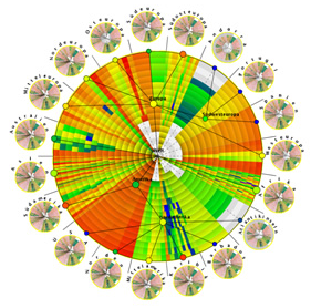
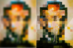
  • Act as a lens. Be able to zoom in and out from a single focal point. For any given topic, the mind must be able to pay attention to the smallest of details while still being able to see the big picture. Understand the color and shape of the individual puzzle pieces while at the same time seeing where that piece fits into the full picture on the puzzle box.
  • Re-focus instantaneously at every level of zoom. Purposely making pictures blurry can provide useful in some instances, but the act of focusing should be natural and automatic. 
  • Like looking at a Magic Eye or a lovely Seurat, be able to find the right level of zoom where the picture is most clear.
  • “Zoom Analytics” as I’ll call it, should be embraced as a common analytical method. It’s always been a mathematical problem solving technique, but not universally taught.

Pan

  • Need to be able to swiftly move from topic to topic, and connect those that are related.
  • Moving back to a previously-visited topic should bring quicker loading of that memory.

Adjust

  • The mind must continuously grow in dimension and adjust for core characteristics. Recognize patterns and contrasts, shapes and sizes, color and form and adjust the view and output accordingly.
  • Toggle perspective and angle to see the infinite sides of any one picture. Perspective is everything.

Layer

  • If the brain consisted of data and memory silos, the main interface should be able to integrate any combination of data and memory into a single comprehensive picture.
  • It should be able to see localized data as well as aggregate data for larger constructs. Filter data and memory based off a set of parameters, re-organize it, and feed it into the common operating picture.

Interact

  • The picture is not static. The brain must by dynamic in nature, allowing a constant influx of new information and updating of old information. 
  • Re-organization of data and memory should be consistent with the changing society in which we live. When a scientific/technological revolution occurs, the way in which our information is processed and stored must be compatible with the changes in society.

Export

  • Not every tool can do every task. That’s why exporting is good. Create a new data set from which you, or someone else, can work. Export a map or a picture that can be analyzed by another set of eyes. For the human, you must be able to transfer stored information to others, and most importantly, communicate it effectively. English is English, math is math, kml is kml.
  • Language is good because it is a standard by which we can effectively communicate. Choosing words wisely is something that should be practiced on top of a common linguistic standard. It’s one thing to speak the same language, but another to foster understanding.

And so, truly finding a balance between big and small perspectives is important. It’s important for making wise decisions, being a team player, being an effective manager, giving valuable advice, and finding optimal direction in life. So as much as you make sure you can get deep in the weeds, make sure you can easily get out.

“It’s not what you’re looking at that matters, it’s what you see.” – Henry David Thoreau

shapes and squiggles

Armed with a pencil and paper, you can simplify about 99% of the world’s problems.

Despite a couple decades of extra-substantial technological growth, there are two things that can never be replaced: the pencil and paper. For the toughest analytical challenges, only so much can be done computationally to simply and digest such problems. For these challenges, the solutions should start with a pencil and paper.

The first step in breaking down a problem is the conversion of the problem from the brain’s three dimensional space to a the two dimensional space of paper. In mathematics, there are several examples of such similar breakdowns: matrix decompositions, polynomial factorizations, projections, transforms, etc. The breakdown is necessary to see things in a new light, a simplified light, and a light that otherwise may not have been turned on.

Step 1. Grab a pad of paper. Do not put boundaries on where you can write and draw.
Step 2. Grab a pencil. Sharpen it and keep the pencil sharpener close.

So now that we have pencil and paper in hand, what do we draw? Well here’s my point. There is a geometric toolbox that provides a valuable framework for the problem solving environment. These are the shapes and squiggles.

1. Matrices

Two-by-two matrices are especially valuable for initial sorting of qualitative data. Assign a binary variable to each axis, name the cells, and define the relationships. Categorizing concepts and attacking each cell independently can help find hidden relationships and provide insight for subsequent analyses. See my previous post on matrix power for more on matrices.

2. Graphs

For more quantitative and scaled concepts, draw a set of axes to start. Visualize relationships between variables by drawing lines or curves and then attack each extremum and graphical sector. Plot knowns and/or hypotheticals on the graph and decipher the meaning of specific coordinates. Jessica Hagy’s blog ‘Indexed’ is a good example of translating mind to graph.

3. Lists and Mind Maps
The proper organization of information is often the most valuable visual tool in solving complex problems. Of course there are technologies to assist in the visualization and organization of information (mind maps, spreadsheets, etc.) but it’s important to use pencil and paper as the primary stepping stone to using some software/web app. Check out a mind map on different mind mapping software and a post on five great uses of mind maps.

4. Circles

Circles have shape and have a shape that is unique. They overlap well, fill space comfortably, and are easy for the human mind to spatially interpret. Eulerian circles (or Venn diagrams) are the simple example of circles put to use on paper for analytical means. There are several other adaptations of circles for comparative reasoning, such as with GL Hoffman’s “gruzzles”.

5. Doodling

The mind works in mysterious ways. Drawing without bounds can release otherwise inexpressible thought. There’s the somewhat structured doodling such as with UI mock-ups, schemas, and decision trees, and very unstructured doodling that might look like an impossible maze of dots and lines. The importance lies in the fact that your brain knows most about the problem, and the pencil is driven by the brain. Any new representation put forth on paper, by your brain, is a new representation of that problem not previously seen. In other words, “doodling allows the unconscious to render in symbolic expression”.

The shapes and squiggles live on. And the shapes and squiggles will always live on because they are the simplest yet most powerful functional tools our mind can use to express our conscious, subconscious, and unconscious thoughts.

matrix power

How much of your life can you fit into rows in columns? Well, enough of it for you to cherish the matrix as a valuable organizational and analytical tool.

Spreadsheets, tables, and matrices are used in every aspect of life. We track finances, monitor tasks, plan our future, and analyze potential relationships with rows and columns. And we are surrounded by this information as individuals, as part of small social groups, and as part of large organizations such as classes, companies, or governments.

More simply, matrices and tables give a new structure to elements of our life that are not always so two-dimensional. From the new structure, we can glean new insights and inspire new visualization of those same elements to make best-informed decisions. To me, a matrix is a valuable analytical tool that helps organize information for insight and action.

(Note that I am using the term “matrix” to represent that much more than numerical arrays of the math world. I am including categorical mappings, tables, lists, and spreadsheets too.)

The University of Cambridge Institute for Manufacturing nicely defines the matrix as an essential decision support tool:
  

“A two by two matrix is a useful tool for initial sorting of qualitative data. The axes should be chosen so that, e.g., the data with the most desirable characteristics will fall into the upper left quadrant and the least desirable in the lower right quadrant. While groups may be unable or unwilling to assign absolute values to qualitative data, they usually find it relatively easy to come to a consensus as to which quadrant something belongs in.

Generally, the two by two matrix is a useful tool for categorising things that can be reduced to two simple variables, particularly when quantitative information is unavailable and qualitative judgments must be made.

It enables a rapid clustering (or separating) of information into four categories, which can be defined to suit the purpose of the exercise. It is particularly useful with groups as a way of visibly plotting out a common understanding or agreement of a subject.”

Authors Alex Lowy and Phil Hood describe the matrix as “the most flexible and portable weapon in the knowledge worker’s intellectual arsenal”.

What’s best about the matrix is that flexibility. Depending on need, you can get as much power out of a 2×2 matrix as you can from a 5×5 matrix. Increased dimension does not translate to increased power. The matrix is flexible and dynamic to the needs of your analysis. You control the path to discovery.

And although matrices do a nice job of pairing categorical relationships, you can also translate these pairs to numerous other visualizations to better contextualize the information at hand. Turn your row and column headers into scaled concepts, map them to some x- and y- axes, and try and fit your qualitative information to a line that describes the relationship between x and y. Is the relationship directly proportional, inversely proportional, linear, parabolic, or along some other path? What do each of these types of relationships mean for your categorical variables?

It’s important to note that there can be fuzzy lines too. Not all cells need to have values and not all relationships need any sort of defined continuity. Empty cells and undefined relationships provide insights that are just as valuable as the populated and defined ones. Lack of data is data in itself, and that’s a great thing.

In the end, the matrix is just one part of the analytical toolbox and can provide a wide range of insight for your personal and professional life. Box up your data, organize it, visualize it, and use new structure to optimize your life.

Examples

Business/Leadership: Gartner, an IT research and advisory company, has created the “Magic Quadrant” to analyze types of entities in the business world. By plotting the ability (or inability) to execute against the completeness (or incompleteness) of vision, businesses can be categorized with those sharing similar characteristics, as Leaders, Challengers, Visionaries and Niche Players. This is a useful example of turning abstract qualities into groups for targeted strategy and decision making.

Product Development/Management: For analyzing how to grow a business from the product side, one matrix shows how plotting types of markets vs types of products can help guide that growth strategy.

Math/Statistics: Type I and Type II error tables are used to describe possible errors made in a statistical decision process. This is a great example of mapping relationships between categories, naming the cells, and using the matrix to understand what each cell represents.

life optimization through estimation

The ability to accurately estimate a target value is an asset to any brain. Learn to hone this ability, embrace it, and use it to optimize your life.

Our lives are surrounded by invisible data – most of it in units of time, energy, space, and money. Essentially, our brains are huge folded databases that store this data, and use it to make decisions, plan ahead, and live each day. But as with many types of data, there exists some uncertainty about that data. Unknowns about how long, how big, how much, from where, until when, should i, almost enough, maybe tomorrow… well you get the picture. Our life data is filled with unknowns.

That’s why estimation is essential. Without it we’d get lost, fall behind, and lose our sense of security and awareness. Whether we know it or not, our brains constantly work to estimate and approximate values, given set of life data at that moment in time. And whether we know it or not, our brains run predictive models to assess hypothetical scenarios, basically using present life data to predict future life outcomes.

These are important realizations, and strong connections of human nature to an innate mathematical realm. Estimation is both an art and a science, as it takes creativity and thought supported by various numerical methods. Having the mathematical ability to estimate proves useful in most situations, but without the artistic component, you lose the ability to understand and contextualize your estimation.

The main point here is that estimation should be embraced as part of human nature, supported by numerical methods. This is how we can optimize our life – by recognizing the units with which our lives are measured each day, and reducing as much uncertainty in those values as humanly possible. It will not make you completely successful and happy and secure, but it will get you close.

Examples

Here are some random examples of estimation from my life. The methods of estimation vary, but the fundamental questions being asked all have outcomes of an unknown nature.

1. Shopping: Budgeting $150 for a dinner party, break budget down to categories of purchases then allocate funds accordingly. Estimate totals and percent of total budget category to make decisions on necessity.
Outcome: Go bigger on the dinner and ask a couple guests to bring desserts.

2. Sports: Ten minutes left in the game, down by 2 goals. Have two full lines of players so will sub soon and again with 4 min left. Need at least 1 goal every 4 minutes leaving a 2 min buffer to protect the tie and go for a win, should allocate 60% of strategy to offense and 40% to defense for next 8 minutes. If I’m in for 6 min and need 60% offensive mindset, how inclined should I be to make a run towards the goal, leaving my defensive position?
Outcome: Win

3. Personal Finance: How much to take out at the ATM? Need to estimate expenses for the week – lunch, happy hour, gas, dinner, cab to meeting, etc. How often will I use my credit card? Am I more inclined to spend if I have cash? Will I be near another ATM this week if I need more cash? How conservative should I be in my spending given the holiday season is arriving?
Outcome: Take out $60 and bring lunch.

4. Daily Planning: Got a hour-long meeting at 3:30pm, soccer game at 6:30pm. Assuming there will be traffic, it will take me 35 minutes to get home then 5 minutes to change, 10 to heat up leftovers, 10 to eat, and 15 to switch and fold laundry. Need 25 minutes to get to field and 15 min to warm up. Will I have enough time if my 3:30pm meeting goes long or do I need to put off the laundry and/or dinner?
Outcome: Always put off laundry, but never dinner 😉

Links

Estimating how much gold there is in the entire world
Estimating how much money there is in the entire world
Estimating the height of anything using geometry
A bit about estimation in statistics

update #2: this year in baseball

Note: This post is related to my February 22, 2009 post on baseball predictions and the mid-season update of those predictions from July 24, 2009.

Well the regular season is over (minus a 1-game AL Central playoff game) and this means the results are in. Here’s how my predictions for the AL East standings turned out:


Predicted AL East Standings 
(February 22, 2009)
Yankees 101-61 (62.4%)
Red Sox 95-67 (58.6%)
Rays 84-78 (51.9%)
Blue Jays 80-82 (49.4%)
Orioles 72-90 (44.4%)

Current AL East Standings 
(October 5, 2009)
Yankees 103-59 (63.6%)
Red Sox 95-67 (58.6%)
Rays 84-78 (51.9%)
Blue Jays 75-87 (46.3%)
Orioles 64-98 (39.5%)

The order is correct, the Red Sox and Rays are exactly right, the Yanks are off by 2 games, the Blue Jays are off by 5 games, and the Orioles are off by 8 games. Collectively, the predictions are off by an average of 1.8% which is very good. If only I knew that the Blue jays would tumble and the Orioles were going to fight the Nats and the Pirates for the worst team in the league.

So the playoffs are coming up, and the match-ups are set (except for the AL Central division winner). The Yankees shouldn’t have a preference between the Twins or Tigers because they will most likely whoop either of them. The Yanks were 7-0 vs the Twins this year (although five of the games were decided by 2 runs or less) and were 5-1 vs the Tigers this year (with a combined score of 30-15). It would be nice to avoid Verlander for two games in a match-up vs the Tigers, but it’s safe to say the run production and grit of the Yanks will definitely put them into the ALCS, regardless of their opponent.

I think it’ll be against the Angels. Sure, everyone roots for a NY-Boston match-up, and Boston typically does well against the Angels, but I think we’ll see a long series end with the Angels moving on.

And despite struggles versus the Angels, the Yanks silence the haters and beat them, winning the ALCS in 6.

In the NL, we’ll see the Cards beat the struggling Dodgers (sorry Torre & Donnie!), and the surging Rockies knock off the Phillies. Cardinals beat the Rockies in a great 7-game series to win the NLCS.

Yankees vs Cardinals World Series: I’ll keep this one simple. Yankees prove they are once again they are the most dominant team in the history of the universe. Carpenter gets a win in a thriller but the Yankees dominate the rest, winning the series 4-1. If you think anything different will happen, then you are crazy. The Yankees are unbeatable now, and will be for the rest of time.

the many faces of vision

According to Wikipedia, “analysis is the process of breaking a complex topic or substance into smaller parts to gain a better understanding of it.” Much of math and science is the same – breaking a large problem into smaller components as a solving technique. We can apply that same technique to gain a better understanding of a words, phrases, and concepts, as I exemplified with the earlier digestion of an Emerson quote.

In most dictionaries, in text and online, the word “vision” has several definitions. Most simply, vision is sight. In business, visions are lofty, longer-term goals of a company. For some, vision is perception, intuition, foresight, and perspective. For others, visions are dreams, ideals, hallucinations, and objectives.

For me, vision encompasses the thoughts, feelings, goals, and desires of an individual to reach an optimal state regarding their self, their groups, the world, and beyond. NOTE:”Groups” refers to a circle of friends, local community, company, class, charity, family, neighborhood, geographical region, political party, etc.

To dive deeper, let’s answer three questions about vision with word lists:

1. What makes vision impaired?
Violence, Stress, Selfishness, Ego, Prejudice, Doubt, Ignorance

2. What makes vision repaired?
Silence, Selflessness, Faith, Consciousness, Awareness, Reflection, Solitude

3. What makes vision shared?
Expression, Compassion, Understanding, Appreciation, Gratitude, Respect, Graciousness, Collaboration

By creating word groups for these types of questions, we can better understand the mechanisms by which our visions can be diminished, restored, and maintained. We can see what stops the train, what can get it back on the tracks, and how to get more people aboard.

And even though vision may be defined differently for each individual, I think we can all agree that the definition includes some sort of internalized thought applied to the external world. Bound by this attribute alone, we can gain collective insight as to how we can read the many faces of vision.

Quotes

“Selfishness is vision impaired, consciousness is vision repaired, and graciousness is vision shared.”

“Vision without action is a dream. Action without vision is simply passing the time. Action with Vision is making a positive difference.” – Joel Barker

“Vision is the art of seeing what is invisible to others.” – Jonathan Swift

“Vision looks inward and becomes duty. Vision looks outward and becomes aspiration. Vision looks upward and becomes faith.” – Stephen Wise

measuring the balance of human life

Can we measure the balance of human life? Perhaps not with 100% confidence, but we can certainly think about the factors contributing to the state of the system at any moment in time and see where the scale might be tipped.

Overview

As students, we learn about the critical role of balance in science, economics, politics, art, and every other subject. Think about chemical equilibrium, energy conservation, supply and demand, political checks and balances, atomic neutrality, mathematical parity, and artistic symmetry. As individuals, we constantly stress the need for a balance in our personal lives. Think about work and family, business and pleasure, excitement and relaxation. Physical components such as those in the first list are measurable, giving us the ability to understand, track, and predict the state of the system. On the other hand, the second list is quite abstract and is mostly qualified by our own personal well-being, the well being of those around us, and the influence on our surroundings as a whole.

So how close can we get to measuring the balance of our personal well being? Let’s run with Ockham’s Razor and try and make it as simple as possible. Consider this statement: the optimal balance of life is when what you take from it is equal to what you give to it. What does that look like?


What You Give
Contributing Factors: Advice, Assistance, Business Opportunity, Care, Directions, Donations, Empathy, Feedback, Friendship, Guidance, Hard Work, Philosophical Thought, Prayer, Product Innovation, …

Notes: It’s all good. There is an infinite amount of mechanisms by which you can give to society, environment, others, and life in general.

What You Take
Contributing Factors: Awareness, Consumption, Control, Crime, Emissions, Faith, Goods, Greed, Growth, Land, New Ideas, Pain, Reflection, Self-Satisfaction, Understanding, Vacations, Waste, …

Notes: There are many bad ones here, but some are obviously necessary and should take the majority of the weight, such as awareness, reflection, and understanding.

Analysis

Units of Measurement: There are concrete and abstract units through which we might measure what we give and what we take.
–Money – Something upon which we are all dependent.
–Time – Something by which we are all bound even though it is out of our control.
–Text, Speech, and Emotions – Can we measure the impact of our words by the resulting sentiment of readers and listeners?
–Acquaintances, Friends, Colleagues, Contacts, Followers – For certain personality types, does the size of an audience have any relevance?
–Quality of Life Factors (Ambition, Happiness, Health, Life Expectancy, Strength, Well-Being) – The toughest to measure, but the most important to global well-being.
–Dreams – Can you measure balance in life by analyzing what your dreams are about?

Deviations from Zero & Tipping the Scale: What does imbalance mean?
–Positive Case – If we give more than we take, we are left with an internal hole. Perhaps we are absent of understanding or self-awareness, or of our purpose in the world.
–Negative Case – If we take more than we give, our impact is diminished and it leaves our surroundings with less to gain.

Collective Balance: Perhaps balance is not to be determined at the individual level but at the level of societal groups and organizations.
–Family – Does your family collectively balance the give and take of life? Is your family happy, stable, and sufficiently contributing to the well-being of other families?
–Work – Does your work collectively balance the give and take of life? Does it contribute to the well-being of society as much as it takes for business growth and distributable profits?

Conclusion

Balance is important. We know that. But perhaps because it’s difficult to measure, the real importance falls on understanding the contributing factors to the state of the system. Like a Jenga tower, pulling pieces must still keep the tower standing.

Finally, we must think about at which organizational level we can best understand balance in human life, and where the ideal equilibrium should exist. By breaking it into its simplest components and visualizing harmony, hopefully that’s exactly what will result.

“Happiness is not a matter of intensity but of balance, order, rhythm and harmony.” – Thomas Merton

update: this year in baseball

On February 22, 2009, I posted my baseball predictions for this year. Today I went back to see how those predictions were turning out and was pleasantly surprised. Here’s how I stand:
Predicted Final AL East Standings (February 22, 2009)
Yankees 101-61 (62.35%)
Red Sox 95-67 (58.64%)
Rays 84-78 (51.85%)
Blue Jays 80-82 (49.38%)
Orioles 72-90 (44.44%)
Current AL East Standings (July 24, 2009)
Yankees 58-37 (61.05%) –> 99-63
Red Sox 55-39 (58.51%) –> 95-67
Rays 52-44 (54.17%) –> 88-74
Blue Jays 47-49 (48.96%) –> 79-83
Orioles 41-53 (43.62%) –> 71-91
The order is correct and collectively the winning percentages are off by an average of 1.00%. If calculating a final win count off current winning percentages, Yanks are off by 2 wins, Red Sox are exactly right, Rays are off by 4 wins, Blue Jays are off by 1 win, and Orioles are off by 1 win. Not too bad I must say… but reveal my methods? Hah!
The other prediction of Cubs playing the Yanks in the World Series may be a bit of a stretch, but they are only 3 games back in the NL Wild Card and are 5-2 out of the All-Star break. Still a possibility.
Finally, I hope I don’t jinx myself here but I’ll pass along a post of why the Bronx Bombers will be winning the AL Pennant. I agree with the power, health, and depth, but it’s too soon to make predictions off current streaks coming out of the all-star break.
“A humble man of grace and dignity. A captain who led by example. Proud of the pinstripes tradition and dedicated to the pursuit of excellence. A Yankee forever.” – Don Mattingly’s plaque in Monument Park

the DIS cycle

Every organization has something to learn. Every organization has data. There is always something to learn from data. Therefore, every organization has something to learn from its data.
A painful problem? Organizations that DO NOT learn from their data.
A more painful problem? Organizations that DO learn from their data but DO NOT build those insights into strategy.
A most painful problem? Organizations that DO learn from their data and DO build those insights into strategy but DO NOT feed the strategy back into the data structuring, collection, and integration processes.
The idea here is that the collection and creation of data has become central to most managerial, informational, and strategic practices in today’s world. Organizations must understand how each data element is to be used in order to optimize the information and insights gained along the way. Organizations must also know what to do with the insights once those insights have been made. Building them into strategy is critical – as long as they are built into the right strategies. In particular, it is imperative for that information to feed back into the original source of the information: the data structure itself. How can new data be created (and old data be refined) to provide new insights and analyses moving forward?
The process needs to be cyclical. Organizations must turn historically linear processes into innovative cyclical ones. Cyclical processes are self-fueling and renewable, whereas linear processes are expensive and always run out of gas. It is that self-sustaining nature of cycles that enables perpetual growth for individuals, teams, departments, companies, and industries.
So how can strategy feed back into the data structure and collection systems?
  • Create new data.
  • Refresh old data.
  • Determine the value of each data element based on where, how, when, and why it is used.
  • Compare internal data to external data sources and data standards.
  • Ride the DIS Cycle backwards to see how data can supplement new, desired insights.
  • Question your data. Love your data. Hate your data. Ask why it works. Ask why it doesn’t.
  • Build quality control and oversight processes to ensure data is used properly.
  • Insert data into your everyday workflow. Build a dependency on your data.
  • Quantify elements of your marketing, product development, customer support, and managerial strategies.
If you create the cyclical process correctly, the data will provide valuable insight that will serve as a self-sustaining support mechanism for your organizational growth and success strategy.

data visualization

The visualization of data exists at the intersection of art, science, and technology. The absence of one of these inputs leaves the viewer unsatisfied in terms of both comprehension and stimulation.

It takes both hemispheres of the brain to produce a truly outstanding graphic – a mesh of logical and analytical components with intuition and creativity. Creators must know the basics of audience, tone, color, consistency, and purpose while understanding technical and scientific limitations of particular data analyses and visualization methods/tools. Creators must also be their own best critic, and be able to ask the right questions at the right time. When done correctly, a final result should bring engaged thinking and meaning to a viewer, no matter how simple the underlying objective.

That being said, I wanted to post some interesting data viz resources to hopefully inspire new creativity and awareness around data visualization. Those are listed below. As a note, some were listed in the latest issue of AmstatNews (monthly publication for the American Statistical Association). All descriptions are from the respective websites and/or other related web resources.

Websites
Flowing Data – FlowingData explores how designers, statisticians, and computer scientists are using data to understand ourselves better – mainly through data visualization. Money spent, reps at the gym, time you waste, and personal information you enter online are all forms of data. How can we understand these data flows? Data visualization lets non-experts make sense of it all.
Gallery of Data Visualization – This Gallery of Data Visualization displays some examples of the best and worst of statistical graphics, with the view that the contrast may be useful, inform current practice, and provide some pointers to both historical and current work.
Gapminder – Gapminder is a non-profit venture promoting sustainable global development and achievement of the United Nations Millennium Development Goals by increased use and understanding of statistics and other information about social, economic and environmental development at local, national and global levels.
Graph Jam – Music & culture for people who love charts. Some recent posts include “Ways I spent my time while playing Oregon Trail in elementary school” and “Things that the Pinball Wizard does”.
IBM Many Eyes – As part of IBM’s Collaborative User Experience research group, the Many Eyes lab explores information visualizations that help people collectively make sense of data.
Information Aesthetics – Inspired by Lev Manovich’s definition of “information aesthetics”, this weblog explores the symbiotic relationship between creative design and the field of information visualization. More specifically, it collects projects that represent data or information in original or intriguing ways.
Junk Charts – Recycling chartjunk as junk art.
Marumushi Newsmap – Newsmap is an application that visually reflects the constantly changing landscape of the Google News news aggregator. A treemap visualization algorithm helps display the enormous amount of information gathered by the aggregator. Treemaps are traditionally space-constrained visualizations of information. Newsmap’s objective takes that goal a step further and provides a tool to divide information into quickly recognizable bands which, when presented together, reveal underlying patterns in news reporting across cultures and within news segments in constant change around the globe.
NameVoyager/NameMapper – This is the online home of Laura Wattenberg, author of the bestselling book The Baby Name Wizard and creator of award-winning tools that have helped the world look at baby names in a whole new way. Check NameVoyager and NameMapper which show temporal and geographic representations of any name in a simple, intuitive interface.
Optical Illusions and Visual Phenomena – Easy to spend lots of time here. These pages demonstrate visual phenomena, and ‘optical’ or ‘visual’ illusions. The latter is more appropriate, because most effects have their basis in the visual pathway, not in the optics of the eye.
Prefuse – Prefuse is an extensible software framework for helping software developers create interactive information visualization applications using the Java programming language. It can be used to build standalone applications, visual components embedded in larger applications, and web applets. Prefuse intends to greatly simplify the processes of representing and efficiently handing data, mapping data to visual representations (e.g., through spatial position, size, shape, color, etc), and interacting with the data. Flare is particularly cool.
Tableau Software Blog – Official blog for Tableau Software, a data visualization software company headquartered in Seattle. I’ve used Tableau Desktop for a few years now and can’t live without it now.
The Work of Edward Tufte and Graphics Press – Official Edward Tufte site. He is an American statistician and Professor Emeritus of statistics, information design, interface design, and political economy at Yale University. He has been described by some as “the da Vinci of Data”.
UC Berkeley Visualization Papers – A listing of papers from the visualization lab at UC Berkeley, from today back to 1995.
Visualization of Complex Networks – This site intends to be a unified resource space for anyone interested in the visualization of complex networks. The project’s main goal is to leverage a critical understanding of different visualization methods, across a series of disciplines, as diverse as Biology, Social Networks or the World Wide Web.

Well-Formed Data, Elastic Lists Demo – This is a demonstration of the “elastic list” principle for browsing multi-faceted data structures. There are additional options to create sparkline charts to show the temporal aspects of the data.
Papers / Presentations
7 Things You Should Know About Data Visualization – EduCause Learning Initiative
Artistic Data Visualization: Beyond Visual Analytics – Viégas & Wattenberg, IBM Research
Designing Great Visualizations – Jock Mackinlay, Tableau Software
Milestones in the History of Data Visualization – Friendly & Denis, York University