
I thoroughly enjoyed Jock Mackinlay’s recent paper on “Designing Great Visualizations”. He contextualizes his insights with a good historical background of the true pioneers such as William Playfair, Dr. John Snow, Charles Minard, and Jacques Bertin as well as more recent theoretical and technological drivers such as Edward Tufte, Ben Schneiderman, Chris Stolte, and Mackinlay himself.
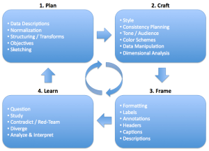
I’m in total agreement that the visual toolbox grows with a better understanding of data fundamentals and software extensibility. His explanations of data types (nominal, ordinal, and quantitative) and possible representations of data (position, length, area, angle, time, space, shape, color) help explore the complexities of human perception and data analysis. To take it further, I included an image describing a good 4-step personal framework for applying my own visual toolbox.

For me, this read is good timing too. As I’m currently reading Daniel Pink’s A Whole New Mind there is an interesting connection between those intricacies of perception, visualization, analysis, and the study of your brain’s hemispherical alignment (here’s one test to see what you might be). How do left brainers interpret an image, as opposed to a right brainer? Based on Pink’s book, the delivery, interpretation, and outcome might all be different. Good stuff.

Hi!
And as a quick follow-up to this post…When I got home from work today there was a brochure for an Edward Tufte 1-Day course held in Arlington, VA. You can choose April 6th, 7th, or 8th for a 10am-4pm session. Fees are $380 which includes copies of all four of Tufte’s books. Neat timing again.If someone is interested… contact number on brochure is 1-800-822-2454 (available 9am-5pm EST).
Now THAT is how you create a visual toolbox.