Negative Space Is A Positive Thing

“It weighs, therefore it is.” – on the study of carbon dioxide by Joseph Black (c. 1756)

I’m currently reading The Invention of Air by Steven Johnson. It’s about the life, work, beliefs, time, and impact of Joseph Priestley – an 18th century scientist and theologian. With his life’s work, Priestley can be credited with enabling what Thomas Kuhn called a “paradigm shift” in his book The Structure of Scientific Revolutions. He did this through transparency of his experiments, thoughts, and findings, and the creation of information networks similar to the coffee shops and online forums we see today.

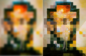
What I find very interesting about Priestley’s work was that he was interested in negative space – the ether surrounding the things we see and touch and feel. Although physically clear, air’s purpose and nature were not. It was not until Priestley questioned the negative space of Earth that the human race began to fully grasp the purposes of plant life, respiration, and chemistry.

Aside from with air, negative space can be found in every subject in all throughout history. In art it’s a resting place for the eye in a painting or photo. In music, it’s a purposeful section of silence. In science, it was the hypothetical medium through which electromagnetic waves travel. In Taoism is was the inaction that served more purpose than action.

Negative space is more representative than anything. It’s the unclear existences, the non-obvious relationships – that which eludes the immediate naked eye. But when sought after, the negative space provides power and energy. It shifts science into new paradigms, pushes art into new dimensions, and builds new meaning from otherwise empty space.

We should continuously embrace the negative space and utilize it for the power and meaning it can hold. Whether in a logo, painting, thought, vision, scene, or air we breathe, it’s often the negative space that brings us life.

Links

data visualization

The visualization of data exists at the intersection of art, science, and technology. The absence of one of these inputs leaves the viewer unsatisfied in terms of both comprehension and stimulation.

It takes both hemispheres of the brain to produce a truly outstanding graphic – a mesh of logical and analytical components with intuition and creativity. Creators must know the basics of audience, tone, color, consistency, and purpose while understanding technical and scientific limitations of particular data analyses and visualization methods/tools. Creators must also be their own best critic, and be able to ask the right questions at the right time. When done correctly, a final result should bring engaged thinking and meaning to a viewer, no matter how simple the underlying objective.

That being said, I wanted to post some interesting data viz resources to hopefully inspire new creativity and awareness around data visualization. Those are listed below. As a note, some were listed in the latest issue of AmstatNews (monthly publication for the American Statistical Association). All descriptions are from the respective websites and/or other related web resources.

Websites
Flowing Data – FlowingData explores how designers, statisticians, and computer scientists are using data to understand ourselves better – mainly through data visualization. Money spent, reps at the gym, time you waste, and personal information you enter online are all forms of data. How can we understand these data flows? Data visualization lets non-experts make sense of it all.
Gallery of Data Visualization – This Gallery of Data Visualization displays some examples of the best and worst of statistical graphics, with the view that the contrast may be useful, inform current practice, and provide some pointers to both historical and current work.
Gapminder – Gapminder is a non-profit venture promoting sustainable global development and achievement of the United Nations Millennium Development Goals by increased use and understanding of statistics and other information about social, economic and environmental development at local, national and global levels.
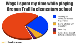
Graph Jam – Music & culture for people who love charts. Some recent posts include “Ways I spent my time while playing Oregon Trail in elementary school” and “Things that the Pinball Wizard does”.
IBM Many Eyes – As part of IBM’s Collaborative User Experience research group, the Many Eyes lab explores information visualizations that help people collectively make sense of data.
Information Aesthetics – Inspired by Lev Manovich’s definition of “information aesthetics”, this weblog explores the symbiotic relationship between creative design and the field of information visualization. More specifically, it collects projects that represent data or information in original or intriguing ways.
Junk Charts – Recycling chartjunk as junk art.
Marumushi Newsmap – Newsmap is an application that visually reflects the constantly changing landscape of the Google News news aggregator. A treemap visualization algorithm helps display the enormous amount of information gathered by the aggregator. Treemaps are traditionally space-constrained visualizations of information. Newsmap’s objective takes that goal a step further and provides a tool to divide information into quickly recognizable bands which, when presented together, reveal underlying patterns in news reporting across cultures and within news segments in constant change around the globe.
NameVoyager/NameMapper – This is the online home of Laura Wattenberg, author of the bestselling book The Baby Name Wizard and creator of award-winning tools that have helped the world look at baby names in a whole new way. Check NameVoyager and NameMapper which show temporal and geographic representations of any name in a simple, intuitive interface.
Optical Illusions and Visual Phenomena – Easy to spend lots of time here. These pages demonstrate visual phenomena, and ‘optical’ or ‘visual’ illusions. The latter is more appropriate, because most effects have their basis in the visual pathway, not in the optics of the eye.
Prefuse – Prefuse is an extensible software framework for helping software developers create interactive information visualization applications using the Java programming language. It can be used to build standalone applications, visual components embedded in larger applications, and web applets. Prefuse intends to greatly simplify the processes of representing and efficiently handing data, mapping data to visual representations (e.g., through spatial position, size, shape, color, etc), and interacting with the data. Flare is particularly cool.
Tableau Software Blog – Official blog for Tableau Software, a data visualization software company headquartered in Seattle. I’ve used Tableau Desktop for a few years now and can’t live without it now.
The Work of Edward Tufte and Graphics Press – Official Edward Tufte site. He is an American statistician and Professor Emeritus of statistics, information design, interface design, and political economy at Yale University. He has been described by some as “the da Vinci of Data”.
UC Berkeley Visualization Papers – A listing of papers from the visualization lab at UC Berkeley, from today back to 1995.
Visualization of Complex Networks – This site intends to be a unified resource space for anyone interested in the visualization of complex networks. The project’s main goal is to leverage a critical understanding of different visualization methods, across a series of disciplines, as diverse as Biology, Social Networks or the World Wide Web.

Well-Formed Data, Elastic Lists Demo – This is a demonstration of the “elastic list” principle for browsing multi-faceted data structures. There are additional options to create sparkline charts to show the temporal aspects of the data.
Papers / Presentations
7 Things You Should Know About Data Visualization – EduCause Learning Initiative
Artistic Data Visualization: Beyond Visual Analytics – Viégas & Wattenberg, IBM Research
Designing Great Visualizations – Jock Mackinlay, Tableau Software
Milestones in the History of Data Visualization – Friendly & Denis, York University

a view from above

How can you not love the sky? I just took this picture from seat 15F on my flight to Chicago O’Hare. I always get a window seat when I fly because I need to see what’s out there below me and above us. This one shows some good cumulus puffs with the most awesome contrast of the clear blue sky. For loving science, and despite having multiple science classes devoted to clouds, weather, the atmosphere, and meteorology, clouds will always amaze me beyond the grasps of physical properties for some reason.

Some people are afraid of flying. I can understand why, as turbulence still makes me jittery and the ear-popping is less than comfortable. However, I can’t forgive others for not finding inspiration in flying 30,000 feet up in the air. It’s a world for imagination and reflection, not to mention a natural artistic wonder unique only to that altitude.

Perhaps the most fun parts of flying are the takeoff and approach, or in other words, zoom out and zoom in. It’s neat to see the houses get smaller and smaller as you zoom out. It’s fun to begin to recognize specific neighborhoods, buildings, or characteristics of the land as you zoom in. Swimming pools become stand outs in the summer. Snow truly looks like a blanket in the winter.

I like to think about history when I’m up in the sky. Scientists, astronomers, philosophers, and the rest of the general population never had the luxury to see above the clouds like I can. I wonder if science and discovery would have taken place differently had the Greeks been able to see down on the earth and up into the sky from 30,000 ft up in the air. I wonder if they’d serve grape leaves on their flights?

Either way, that was a good nap. Time to zoom in now.

“Above the cloud with its shadow is the star with its light. Above all things reverence thyself.”
–  Pythagoras

learnin’ the harp

Music and art have defined much of history. Through all the economic ups and downs, regime and boundary changes, social revolutions, technological developments, wars and religious crusades, and astrological and continental discoveries, the love and fascination with music and art have remained consistent.

That being said, I think everyone has a component of his/her personality rooted in music and art. Again, that creative right-brain mentality, even for left-directed minds, still has some influence on everyday thinking and action, even if we don’t realize it. (As a side note here, I’m reading This Is Your Brain On Music by Daniel Levitin where in his introduction, he introduces work that backs up the idea of music being distributed throughout both brain hemispheres.)

For me, I’ve always been intrigued by all types of music and art, the people who create the music and art, and the effects they have on all types of audiences. However, I’ve always been an atrocious musician and artist in terms of instruments and paintbrushes. I’ve tried the guitar, the piano, drums, painted plenty of horrible faces, horizons, and animals, and easily knew that it wouldn’t work as a profession. On the other hand, I could always read music, understand tones, scales, contrasts, textures, themes, and always enjoyed interacting with art and music. Singing was fun, and writing, drawing, and doodling became very fun too. So now, in an effort to continue a connection to art and music, I’m back at a new instrument…

The harmonica! Good supplementary instrument to singing and also good for some drunken blues singing (which you can never get enough of around a campfire). It’s my intention to keep the blogosphere (well the sliver of it that reads The Adsideologist) updated on my progress. I’ve read a beginner book and watched plenty of YouTube and played along plenty of DMB, Dylan, Petty, Blackfoot, Popper, Stones, Boss, and Billy Joel. We’ll see what happens.

I’ll leave you with my end goal song to play: But Anyway – Blues Traveler